Mapping Population Change in the United States
Product: Lesson Plans
Author: PRB
Date: April 11, 2007
Focus Area
The United States is a dynamic country, where the increasing complexity of American society calls for an examination of change. For Americans to adjust to new demands for resources, transportation, school systems, employment opportunities, and social services, they must understand the level and geographic distribution of population change. In this activity, students will create a choropleth map to illustrate the population growth rate of the United States. Students will learn how to construct a choropleth map, analyze the distribution of population change in specific regions, and discuss the impact of this change for the future.
Grade Levels: 4–12
Time Required: 1 to 2 class periods
Standards Addressed: The geographically informed person knows and understands how to use maps and other geographic representations, tools, and technologies to acquire, process, and report information from a spatial perspective; how to analyze the spatial organization of people, places, and environments in a spatial perspective; how the characteristics, distribution, and migration of human populations on Earth’s surface; and how to apply geography to interpret the present and plan for the future.
Skills and Objectives:
- Ask geographic questions about population growth in the U.S.,
- Organize geographic information by preparing a choropleth map,
- Analyze geographic information about the distribution of population change, and
- Answer geographic questions about the impact of population change on resource use and services.
Vocabulary: population distribution, growth rate, choropleth map
Materials Needed:
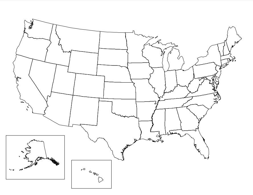
- United States Outline Map (PDF: 28KB)
- Data from the U.S. Census Bureau: www.census.gov
- Crayons, markers, or colored pencils
The Learning Activity
Background:
Depending on the students’ skill level, review the concept of choropleth mapping and its importance for representing data. The teacher may choose to show a choropleth map as an example.
Introducing the Activity:
First, provide students with the United States outline map. Ask students to speculate on the growth trends of the United States by looking at the state map. Teacher may refer to a map of the population size of each state, prompting students to speculate on any changes relative to current population size as well as to state area. Do they think that the states with the largest population will grow the fastest or will the states with the largest area?
Provide students with the “2000 Data Table” or data from the Census Bureau and ask them to draw conclusions based on the information about population change. What assumptions can be made from these data? Which areas are growing the fastest? The slowest? Are there any regional trends apparent in the growth rates of these states?
Executing the Activity:
Discuss how students could interpret these data to answer these questions about population growth. Point out that maps provide a visual representation of information, making data easier to understand. Students can use maps to organize information in a meaningful way by identifying regions and analyzing their content. The students will construct their own choropleth map to represent population growth for the United States in order to answer these questions.
- Ask students to quickly rank the 50 states and DC according to their growth rate indicated on the “2000 Data Table.”
- Next students must examine the data and determine the categories to be used for classification. (Teacher may choose to review directions for making a choropleth map and selecting classes and ranges.) For this lesson, the population growth of United States will be mapped using the following set of ranges:
Percent Change 1990–2000
25.0% or Greater
10.0% – 24.9%
5.0% – 9.9%
0.0% – 4.9%
Less than 0.0% - Students will create a choropleth map using the United States outline map. Each range/class will be colored differently. Color selection is based on the values they will represent. Brighter colors or darker shades of the same color indicate greater values; and dimmer colors or lighter shades indicate lesser values. Areas are distinguished one from another using different colors or different shades of the same color. These colors also indicate which values are greater in comparison to other values. Possible color selections for this map: 25.0% or greater, purple; 10.0% – 24.9%, red; 5.0% – 9.9%, orange; 0.0% – 4.9%, yellow; Less than 0.0%, white. (Reminder: All maps should contain a title, key, and source.)
Concluding the Activity:
When the maps are completed, ask students to examine the maps and draw conclusions from the data. Review the questions asked in the beginning of the lesson:
- What conclusions can be reached from the data on population growth?
- Which areas are growing the fastest? The slowest?
- Are there any regional trends apparent in the growth rates of the United States?
- What does this information mean for each state when making decisions about providing certain services, transportation, education, etc.?
Evaluating the Activity:
Students can be evaluated on the accuracy of their maps and their participation in the discussion of the map. Students can also be asked to do a writing assignment.
Extensions and Variations:
- Have students create maps for other demographic variables of the United States or for counties within a state. A good source of data is the County and City Data Book from the Census Bureau at: www.census.gov.
- Have students write a mock proposal to their local government about changes that should be made in providing different services to the community, based on the evaluations from their maps.
- Allow students to create choropleth maps on their own, having them establish classes and colors.
- Have different groups of students create independent maps of different states using a particular demographic variable and then have them compare.

 ">
">