Mark Mather
Associate Vice President, U.S. Programs


Source: PRB analysis of data from the U.S. Census Bureau.
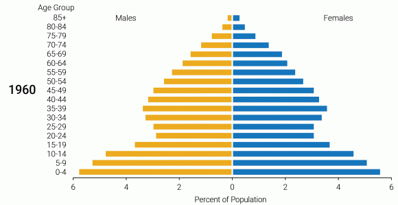
Three demographic trends account for changes in the age structure of the U.S. population in recent decades. First, a shift toward smaller families began in the late 1960s. During the baby boom, the total fertility rate (TFR), or the average number of lifetime births per woman, peaked at over 3.5. But by the mid-1970s, the TFR had dropped to just 1.7—the lowest level ever recorded in the United States. Second, increases in life expectancy—an estimate of the average number of years of life remaining at a particular age—have led to a growing population of older adults relative to those in younger age groups. Between 1980 and 2016, average life expectancy at birth increased from 73.7 to 78.6 years.3
Third, declines in immigration have reduced population momentum by limiting the number of young adults of reproductive age who are moving to the United States and starting families. The number of women ages 25 to 44 increased by 35 percent (from 31.8 million to 42.9 million) from 1980 to 2017, but is projected to increase by only 15 percent between 2017 and 2060 (to 49.3 million). Slower growth in the number of women of reproductive age, in combination with falling fertility rates, is resulting in fewer births and children relative to the number of older adults in the population.
The future size of the older population relative to the population of children and working-age adults will depend in part on trends in immigration. The latest projections from the Census Bureau assume that net international migration (the number of immigrants minus the number of emigrants) will peak at around 1.1 million per year by 2060.4 But if future immigration levels are higher than the Census Bureau projects, the number of older adults could be reduced relative to those in younger age groups.
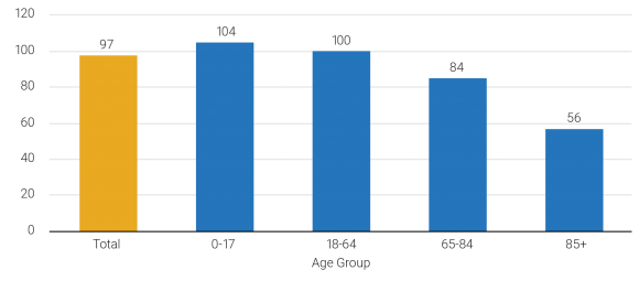
The number of males per 100 females in a population, or the sex ratio, can vary depending on sex differences in health risks and behaviors, mortality rates, immigration patterns, and other factors. In the United States, as in other countries, newborn males outnumber newborn females, while females are more likely than males to reach older ages. The projected U.S. sex ratio in 2020 favors women slightly, at 97 men per 100 women, but patterns vary across age groups. The Census Bureau projects that the sex ratio in 2020 will be 104 for children under age 18, but only 56 for adults ages 85 and older (see Figure 3). Among centenarians, there will be only 30 men per 100 women, according to the Census Bureau’s projections for 2020.
Women live longer on average than men in the United States and in nearly every country in the world. But in the United States, the gender gap among older adults has shifted during the past century. At the turn of the 20th century, there were 102 older men (ages 65 and older) per 100 older women. By 1990, the sex ratio among the older adult population had fallen to 67, its lowest recorded level.5 Since then, the sex ratio among adults ages 65 and older has rebounded and is projected to increase to 81 by 2020 and to 86 by 2060.
Researchers have linked U.S. trends in the gender gap in life expectancy at older ages to male and female patterns of smoking, which increase the risk of an earlier death from lung cancer, heart disease, chronic obstructive pulmonary disease, and stroke.6 During the first half of the 20th century, smoking prevalence rates among men and women
converged, as men’s rates declined from their earlier peaks and women’s rates increased, leading to a rise in smoking-related deaths among women relative to men.7 Smoking prevalence peaked among women born in the early 1940s, whereas prevalence rates peaked for men born in the 1910s. The result has been a steady reduction in smoking-related deaths among older men and an increase in deaths among older women.

Source: U.S. Census Bureau, vintage 2017 population projections for 2020.
A changing sex ratio has implications for caregiving in old age. Historically, older adults have relied heavily on family caregivers to provide support and care when they needed assistance. However, fewer children and high divorce rates among baby boomers mean that more may live alone in old age without either the financial and social support or informal caregiving provided by a spouse or child. Spousal care could potentially help fill this gap; with more men surviving to old age, more potential partners may be available to provide informal care for older adults.
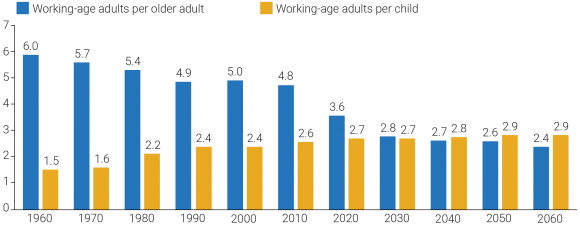
Policymakers are concerned about the growth in the population ages 65 and older, and whether the U.S. workforce will be large enough to support future spending on Social Security and Medicare. One way to measure this support is through the old-age support ratio—the number of working-age adults ages 18 to 64 for every person age 65 or older. The old-age support ratio is just an approximation because some people stop working before they reach age 65, and a growing share of adults are continuing to work into their late 60s and early 70s. In 1960, there were 6.0 working-age adults for every person age 65 or older.8 The ratio is projected to drop to 3.6 by 2020 and even further—to 2.4—by 2060. This projected decrease in the number of workers relative to those who are retired or can no longer work could have implications for the old-age support systems currently in place.
While the old-age support ratio has decreased in recent decades, the support ratio for children—the number of working-age adults per child under age 18—has increased. Between 1960 and 2010, the ratio has gradually risen from 1.5 to 2.6 working-age adults per child (see Figure 4). By 2040, the support ratio for children (2.8) is projected to exceed the old-age support ratio (2.7) for the first time in U.S. history. These shifting support ratios may lead to higher levels of public spending on the health and economic well-being of older adults, relative to young families and children.

Note: The old-age support ratio is the number of adults ages 18 to 24 per adult age 65 or older. The support ratio for children is the number of adults ages 18 to 64 per child under age 18.
Source: U.S. Census Bureau, decennial censuses and vintage 2017 population projections (2020-2060).
While the solvency of Social Security benefits depends on the old-age support ratio at the national level, the provision of many programs and services for older adults occurs at the state and local levels, where low old-age support ratios may already be raising challenges. Nationwide, there were about four working-age adults (ages 18 to 64) per person age 65 or older in 2017. However, in roughly 40 percent of U.S. counties, the old-age support ratio has already fallen below three working-age adults per older adult. Many of these counties are located in areas with high proportions of retirees, such as Florida, which has been a longtime retirement magnet. But parts of Appalachia, the Northeast, and the Great Plains are aging not because older adults are moving in, but because so many young adults have moved elsewhere. Over three-fifths of counties in Maine, Montana, Nebraska, North Dakota, and West Virginia have fewer than three working-age adults per older adult. Local areas with sustained outmigration of young adults can experience declining tax revenues, shrinking school enrollments, and declines in the availability of services, such as health care.
This article is excerpted from Mark Mather et al., “What the 2020 Census Will Tell Us About a Changing America,” Population Bulletin 74, no. 1 (2019).
1 Mark Mather, Linda A. Jacobsen, and Kelvin Pollard, “Aging in the United States,” Population Bulletin 70, no. 2 (2015).
2 U.S. Census Bureau, “Population Projections,” www.census.gov/programs-surveys/popproj.html.
3 Centers for Disease Control and Prevention, “Table 15. Life Expectancy at Birth, at Age 65, and at Age 75, by Sex, Race, and Hispanic Origin: United States, Selected Years 1900–2016” (2017), www.cdc.gov/nchs/data/hus/2017/015.pdf.
4 U.S. Census Bureau, “2017 National Population Projections Tables” (Sept. 6, 2018), www.census.gov/data/tables/2017/demo/popproj/2017-summary-tables.html.
5 Historical sex ratios are derived from Table 5 in Frank Hobbs and Nicole Stoops, Demographic Trends in the 20th Century, Series CENSR-4 (Washington, DC: U.S. Government Printing Office, 2002); and U.S. Census Bureau, 2010 Census Summary file 1; 2017 American Community Survey.
6 Life expectancy represents the average number of years of life remaining at a given age, if age-specific mortality patterns remain constant in the future.
7 Samuel H. Preston and Haidong Wang, “Sex Mortality Differences in the United States: The Role of Cohort Smoking Patterns,” Demography 43, no. 4 (2006): 631-46.
8 Data are derived from Table 5 in Hobbs and Stoops, Demographic Trends in the 20th Century.